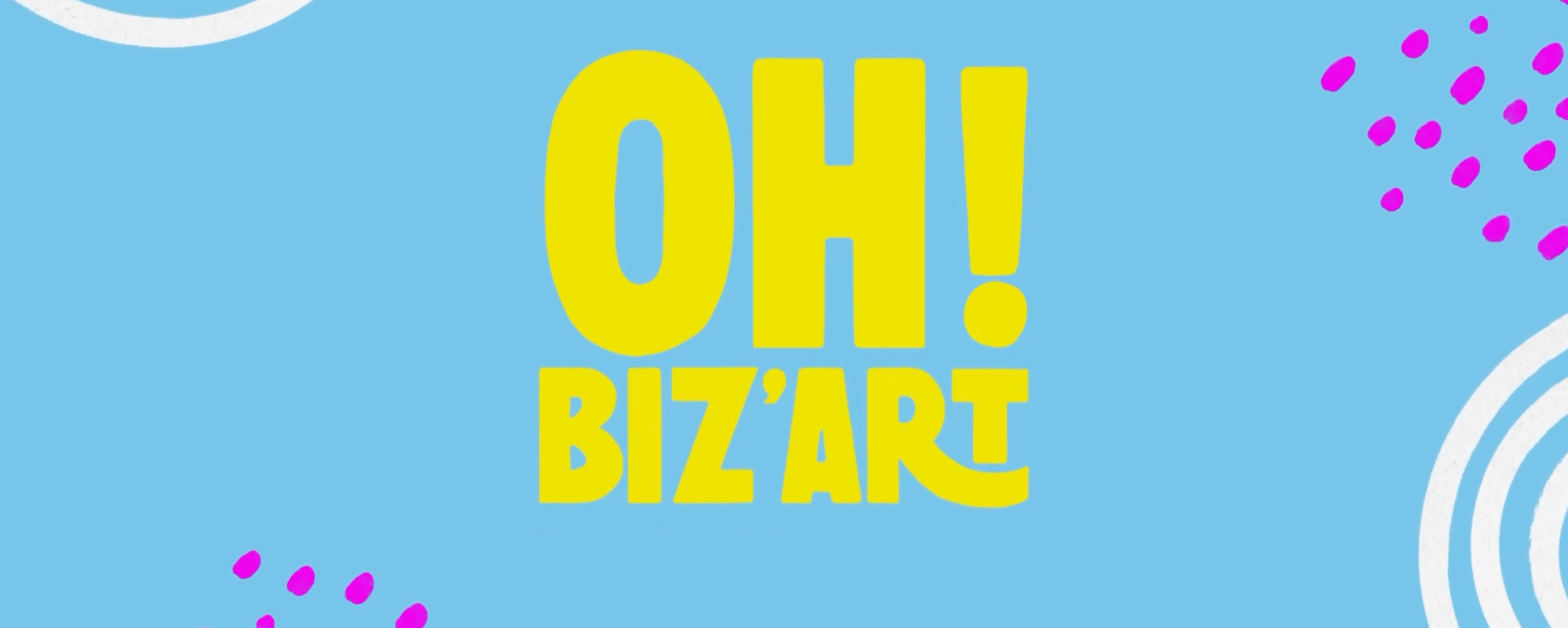
Oh! Biz’Art — Cultural nuggets in snack-sized format
Bringing a taste for fine art to French TV audiences
France TV
The public television in France
Context
Art takes center stage before Sunday night’s movie! With its short and playful segments aired during prime time, France 2 aimed to create “a cultural interlude that is both entertaining and unique.”
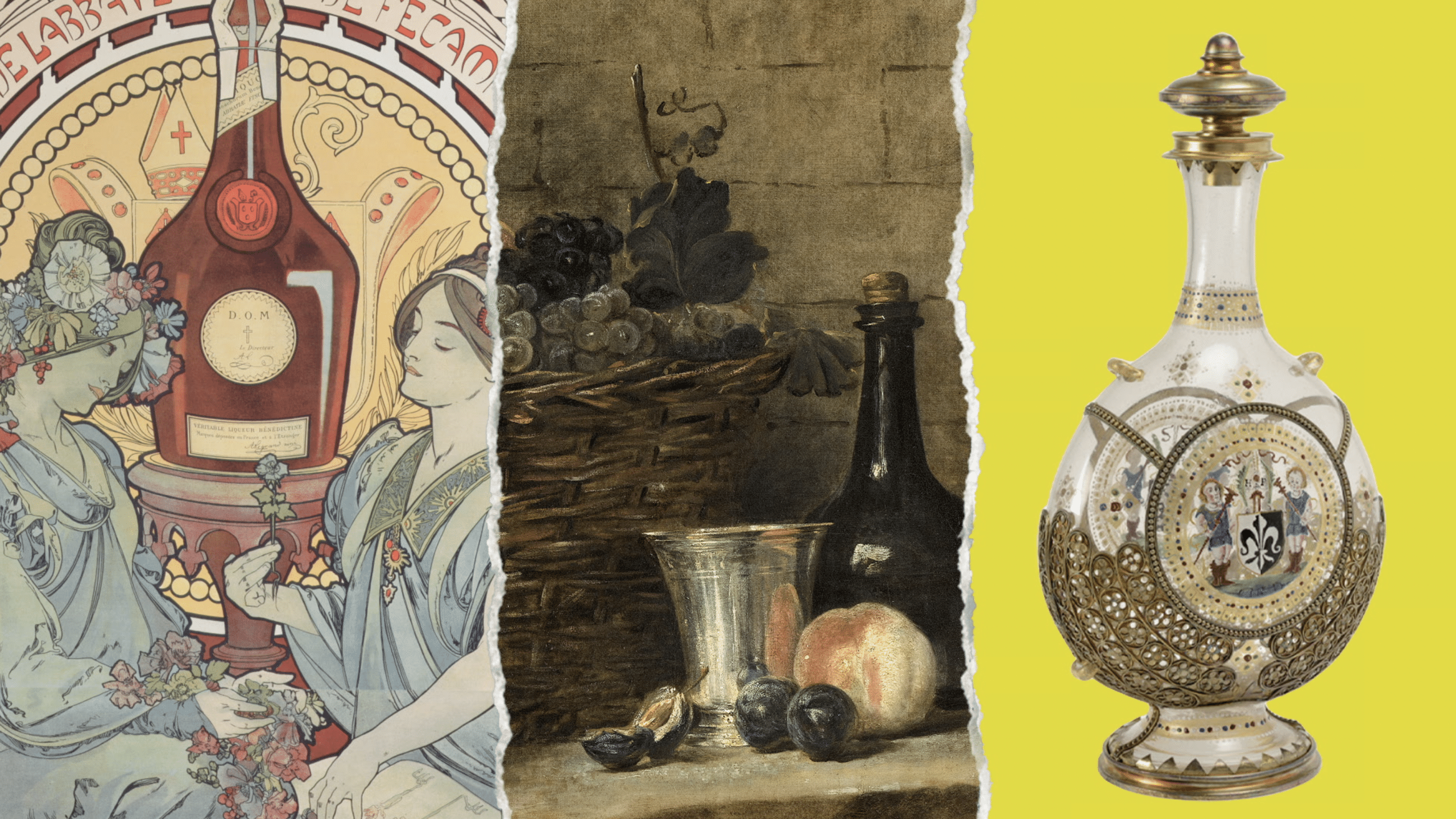
Oh! Biz’Art follows in the footsteps of Ouh là l’art, introducing an entirely new concept. Each week, a central theme serves as a common thread, connecting vastly different artworks: “the hand” takes us from the caves of Cuevas de las Manos to JR’s West Side Hand; “red” becomes a guiding motif, leading from the red bison of Altamira to Banksy’s balloon.
Written and narrated by Stéphane de Groodt, this content needed a distinctive visual universe that would both stand out and bring the featured artworks to life. D18, the production company behind the series, turned to Cartoonbase to bring it to the screen.
Challenge
How do you create a visual style that highlights both prehistoric paintings and pop art? A style that serves as a common thread without stealing the spotlight? While creating an immediately recognizable identity for the series?
We needed to find a visual concept that would do the featured masterpieces justice while translating Stéphane de Groodt’s linguistic genius, known for his bold wordplays, into images.
We were looking for a concept that was both flashy and subtle – quite a challenge.
Moreover, speaking to a diverse audience of enthusiasts, amateurs, and casual art lovers involved making the content highly accessible and appealing without disappointing the subject matter experts.
Approach
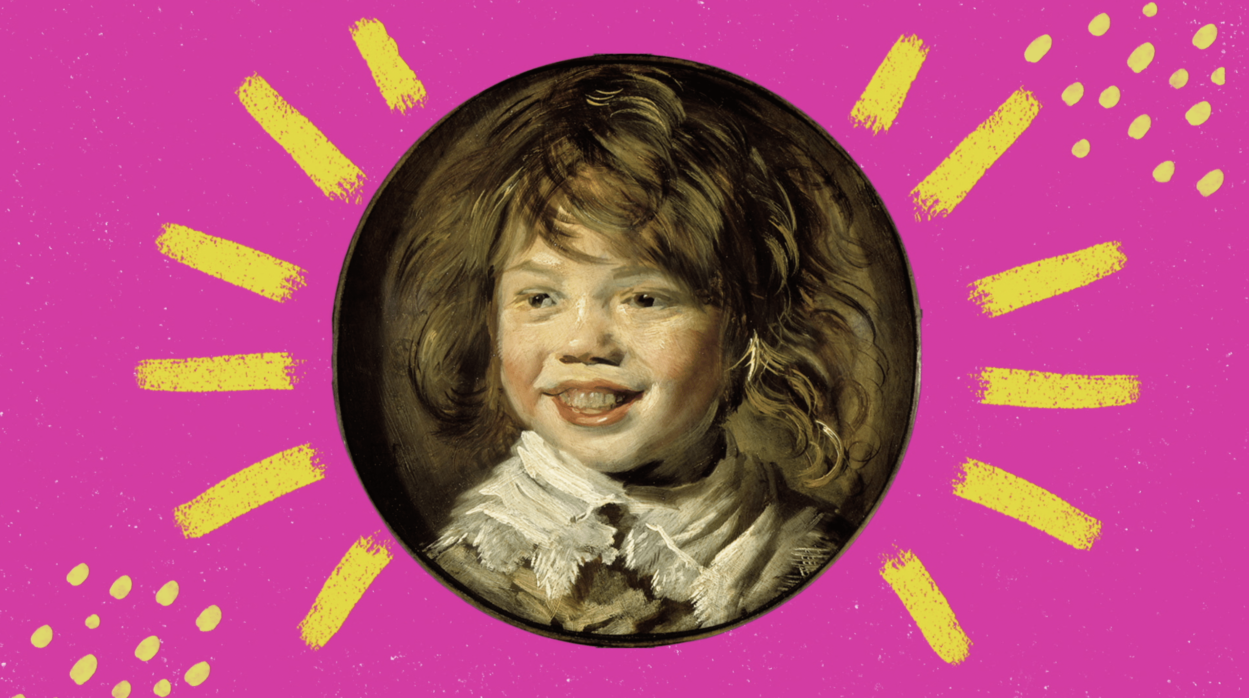
Rhythmic and pop. We create a distinctly dynamic visual universe, supported by a soundtrack that matches its energy. To reflect the playful nature of the narration, the pastel-toned visual framework is modern and lively: it places historical artworks in a contemporary context, inviting viewers to explore them—or simply be inspired for the duration of the show.
Composition and decomposition. To seamlessly integrate these artistic gems into a cohesive narrative, we literally deconstruct them, allowing them to “communicate” with each other—by isolating certain objects from their background, for instance.
A unified visual identity. To make the series instantly recognizable, we designed consistent opening and closing sequences for each episode. Visual effects—such as torn paper textures—typography, and carefully selected textures come together to give the series its unique identity while preserving the essence of each artwork.
Impact
 ,
, your
your .
.
