visit.brussels — One visual identity for one eclectic city
Around Brussels in 100 illustrations

Visit Brussels is the promotion and communications agency for Brussels-Capital Region’s tourism department.
Context
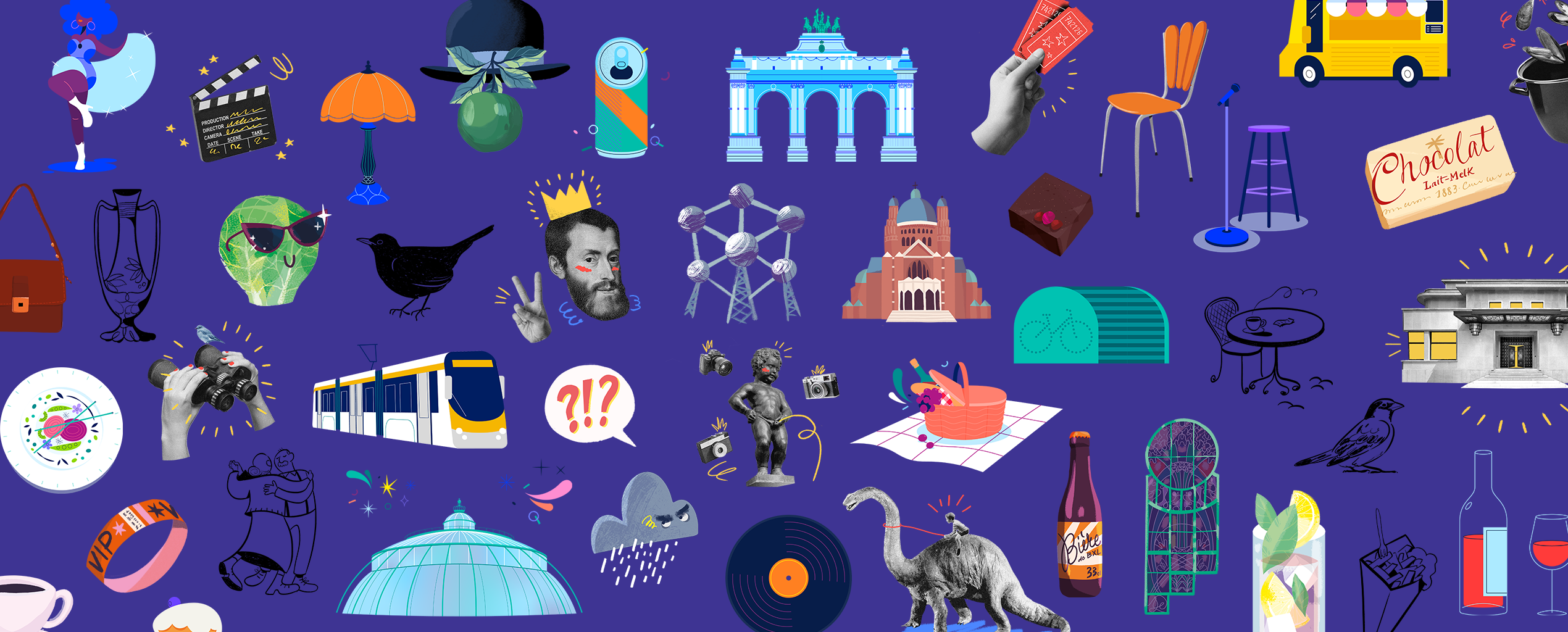
Visit Brussels came to us with their new visual identity and a dream for their tourism communication. We turned these visual guidelines into a series of illustrations that could be used on all its communication platforms.
Challenge
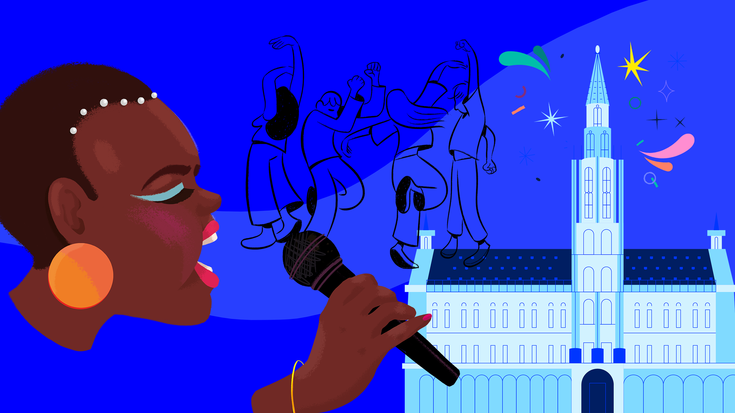
Figuring out this project was no small feat. Visit Brussels needed 100 individual illustrations that would speak to citizens and visitors alike. Our high standards meant that each one had to be a hit – so we called in the troops.
Our approach
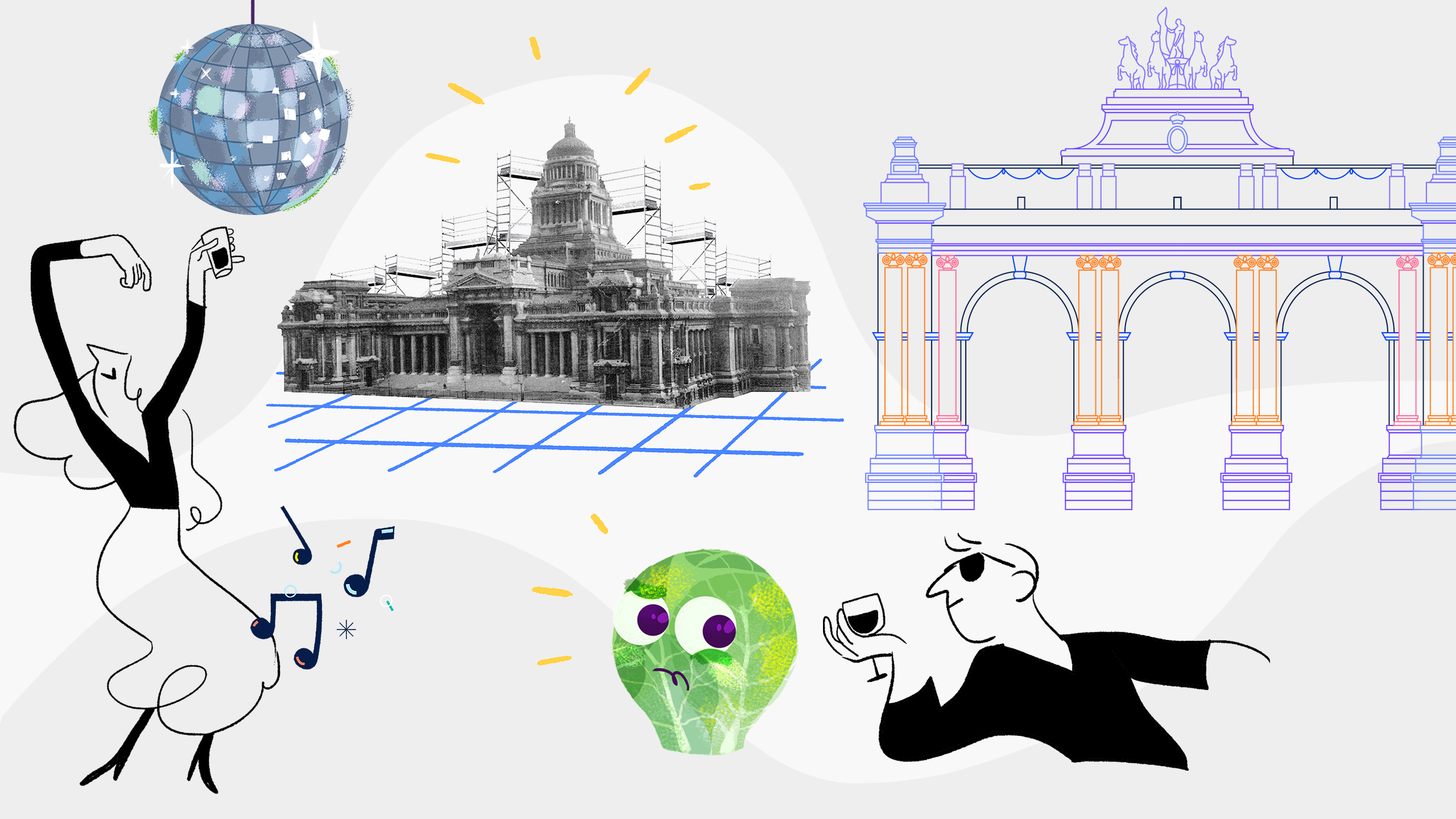
Call in the Troops: Not one, not two, four illustrators were dedicated to the project. The richness of this project is in the diversity of graphic styles utilised for a single brand. The tourism communication project allowed us to play with the visual guidelines and create a variety of visuals to bring everyone to the city of Brussels.
A Global City: Brussels, Wallonia and Flanders; Europeans from the four corners of the continent; newcomers or Brussels natives of all ages… Just like the city around us, the project mixed languages, cultures and identities.
We showcased the city from different angles, depicting the best Brussels’ locations and landmarks with humour and style – avoiding stereotypes and focussing on making the illustrations fun for anyone that might find themselves moving around the city.
Luckily, as true Bruxellois/Brusselaren, we knew what makes our city so special. In this way, we were perfectly positioned to create visuals that highlight what makes it unique.
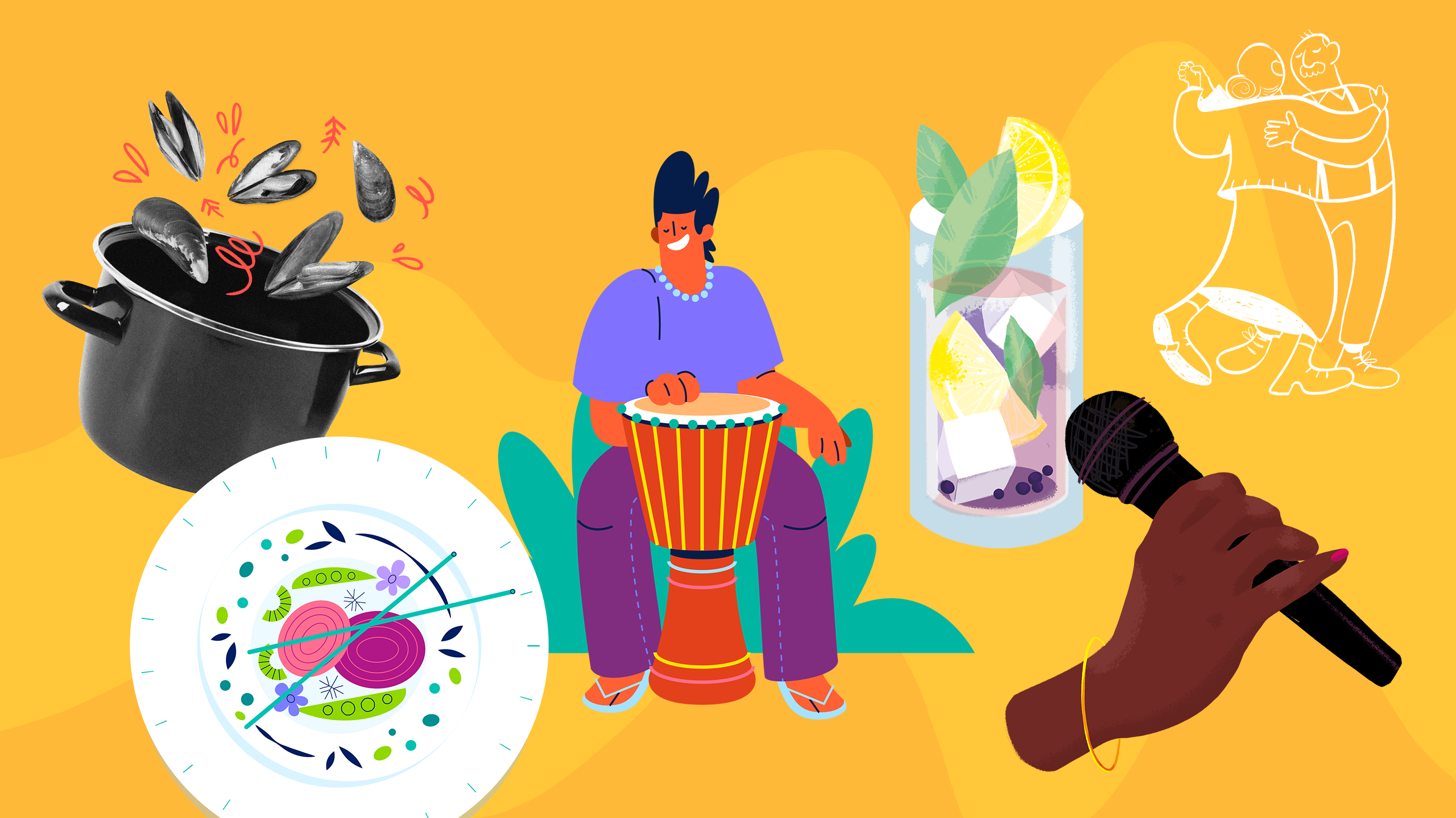
Can I see these in a different size? More than happy to use their creativity and talent to showcase the Capital, our illustrators went the extra mile by offering variants of their illustrations. Sometimes a client wants to tweak illustrations here and there, so we futureproofed the project by providing a veritable smorgasbord of options for all their needs – putting the supply ahead of the demand.
Our Impact
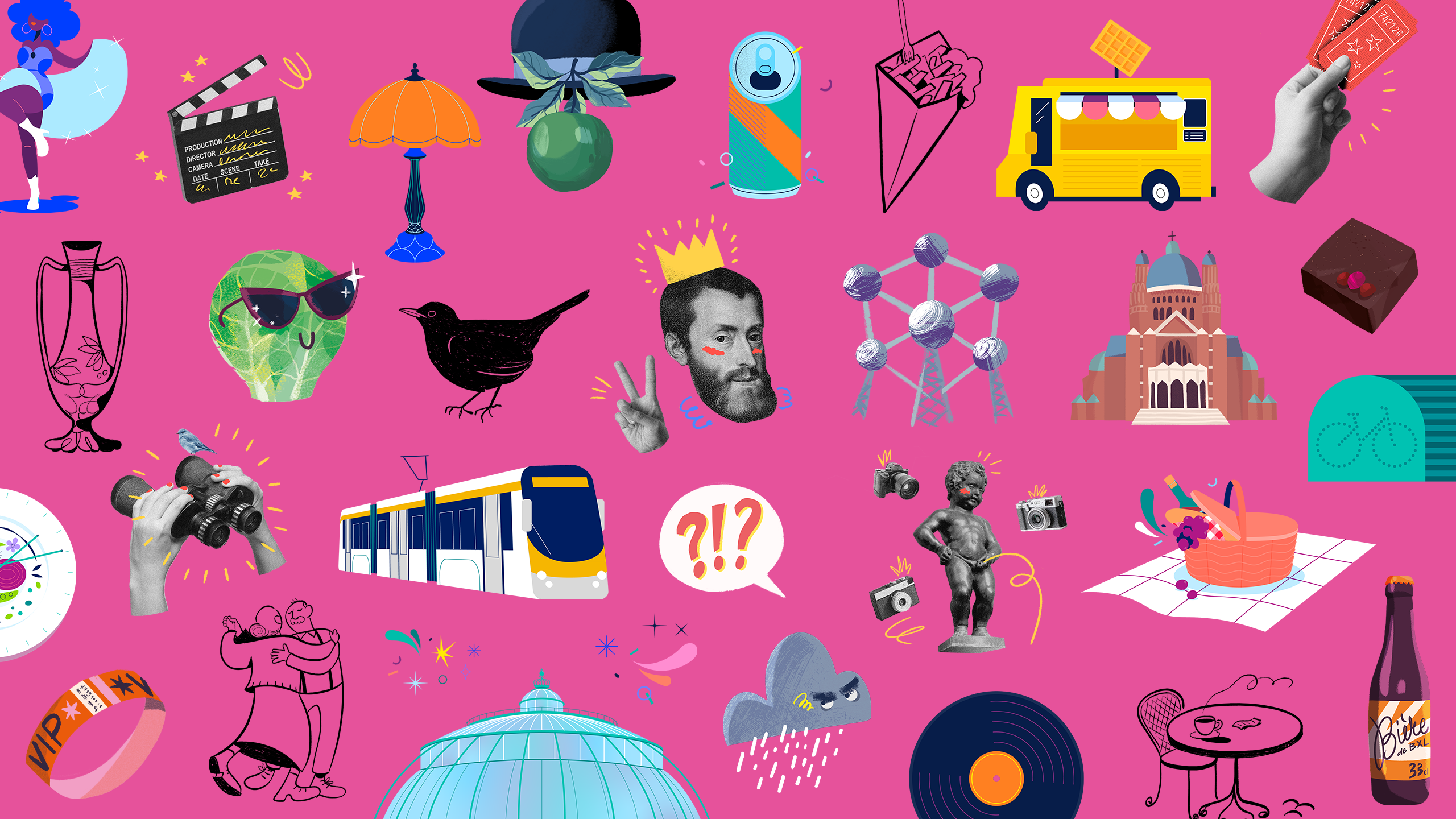
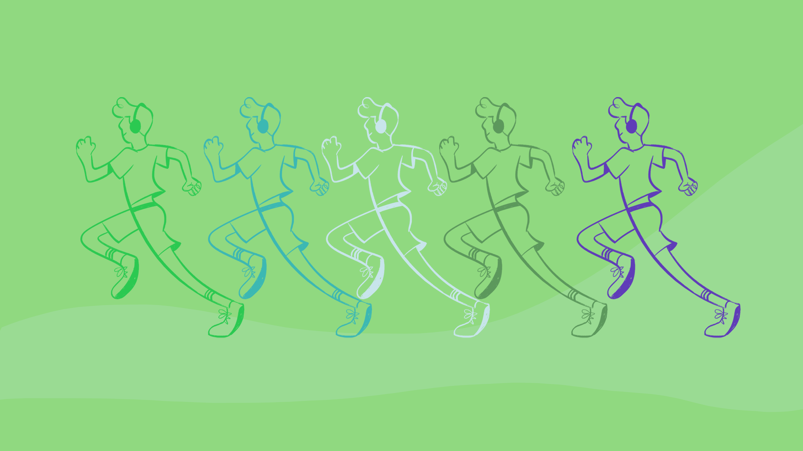
Diversity is the key word when describing these 100 illustrations, all depicting Brussels in their very own style. This work underlined visit.brussels’ visual identity, making it unique and eye-catching. Those versatile visuals can now be applied to any communication need, ensuring coherence between all materials.
To quote Visit Brussels themself:
